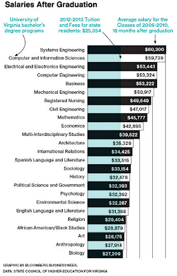
Lots of things. If you just compare the list price of tuition and fees and immediate average salary, you get this, for UVA.
Obviously this excludes the non-pecuniary benefits of 4 years of college fun and the lifetime benefits of knowing stuff, as well as career income. External benefits from a better educated population are also ignored. On the cost side it excludes the opportunity cost of 4 years of foregone income, and it does not account for scholarships – which probably go to the people who end up in higher paying majors.
The chart is from Bloomberg, the data is from CollegeMeasures.org, which will apparently will eventually produce similar data for the University of Oregon. I hope they start adding better controls – obviously this figure tells us nothing about the value added by college major, even if we restrict the dependent variable to initial income. Work like this should be taken with a block of salt.
Thanks to Ryan Frank for the tweet. 12/24/12.

As you point out, a stupid chart.
UVA’s Bio students are cramming for med school. Most get in, and yes, 18 months later they have an income of zero. Not exactly a tragedy for them!
I don’t think this accurately reflects the reality on the ground at the U of O. For example, I don’t think the top of the chart would be so loaded with Engineering disciplines here.
Dog Says
I have always thought that “income” measures per major field
are crap. What I would like to see, and data is not actually
available for this, is the percentage of various majors that
actually get a job within their major field as their first job after
graduation. That’s a measure of how well our current majors curriculum is preparing them for the real world. Yes, I know, the UO instills
critical thinking, we are not a Vocational Tech …
That said, income is a predictor of many things one might care about… health, the health of one’s children, the education of one’s children, age at death, the age one’s children die at, charity, public participation, etc.