I’ve put together a simple alternative UO homepage with useful UO links and no 160over90 branding crap, here.
12/31/2014 update: We’re on the hook for 4 more years?
Wed., Dec. 31, 2014
University of Oregon Kicks Off Branding Push
By Kevin McCauley
The University of Oregon will use its Jan. 1 Rose Bowl (Pasadena) appearance to kick off a four-year branding initiative handled by the Newport Beach, Calif., office of Philadelphia headquartered 160over90 shop.
The push is to promote the idea its academic program is equivalent to the excellence of its athletics. …
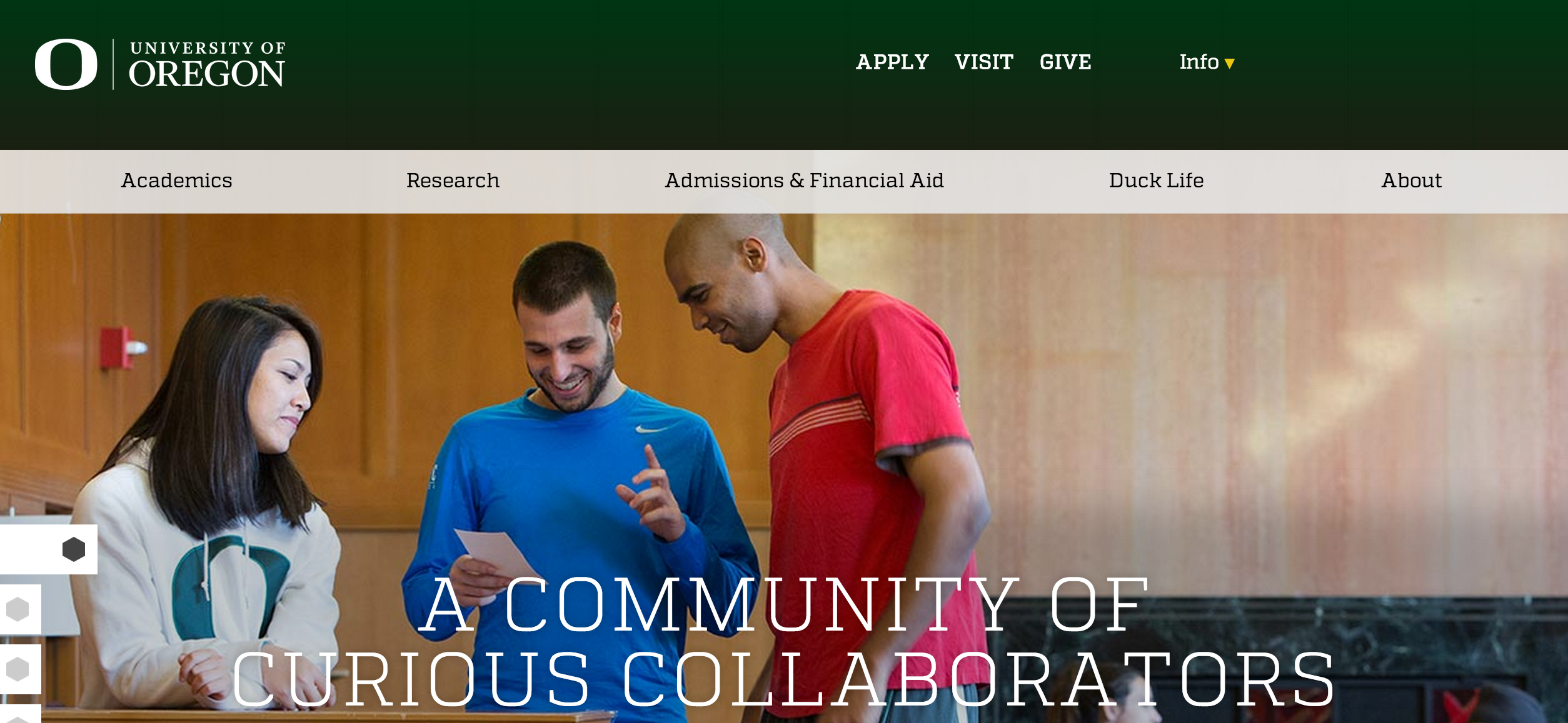
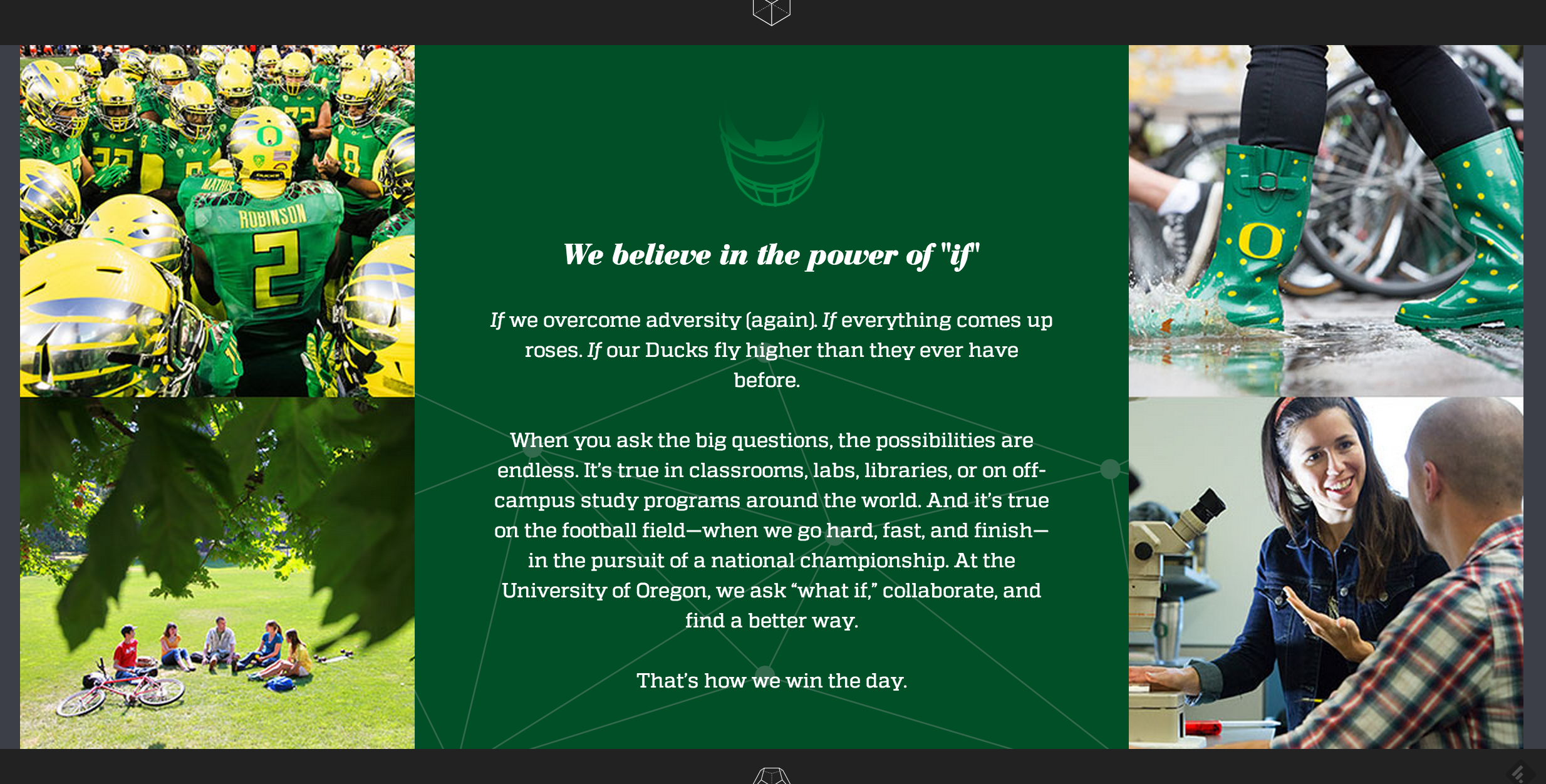
12/29/2014: UO unveils new $5M web page and motto: “We believe in the power of if”.
Apparently our 160over90 branding consultants are unfamiliar with the seminal (or should I say ovarian?) work on university web page design (thanks to SS for the link):
It is possible to find a link to DuckWeb. For a price, I’ll show you the way.
Come on, be a sport!
Or readers can just go to the mobile version at http://uoregon.edu/m which cuts out all the Duck crap and leaves the links.
The “mobile version” link doesn’t work (anymore?). But I figured out this, to get to the useful stuff:
http://uoregon.edu/#footer
Bookmark it!
(Control-U is great.)
Honestly, this is all they need…
This is similar to Hewlett-Packard’s slogan in the late 1980’s. Their slogan was “What If”. UO’s is “Power of If”.
I actually kinda like this slogan – I think it’s very fitting.
“IF this university cared about academics, then your degree would be valuable!”
“UO is great, IF you don’t care about women’s safety!”
etc.
Makes me think of Enron: “Ask Why”
Please tell me you are making liberal use of dramatic license and that the new website design did not cost $5 Million?
I am pretty sure that a couple hundred of hours of work study for CS students could have yielded a much more functional site and given some much needed hands on for our grads.
the uoregon site feelsone of the free wordpress templates . I bet the ones responsible for the site took their standard template, slapped some green, a few O’s and a few goducks. There is no way it should be five million dollars.
What if we stopped subsidizing sports…
What if??
Also nice fucking alliteration.
“A community of curious collaborators”
Aka “trying too hard”
Even just “Community. Curiosity. Collaboration.” is approximately one million times better.
“Our copy, design, and functionality would all improve IF we invested in the expertise and skill of existing community members instead of hiring a pointless outside PR firm.”
What was that about community and collaboration again? Huh.
At least they were up-front about the football team now being the brand ambassadors of the University of Oregon. But the synecdoche makes me very uncomfortable. Do we really want to market ourselves as a football team with a university in the back?
Perhaps metonymy is a more accurate description insofar as the AD and its sports subsidiaries act quite independently of the UO.
the real question is nothow much it cost but how long it will take to remove and replace this functional and artistic disaster.
I hope that this is a first draft. If you hit the link for “about” and scroll down, there appears this sub-slogan:
Competitive Excellence: rooted in history with eyes on the future.
Which sounds like a statement about potatoes.
I hope future versions of this webpage put less emphasis on promotional flash and more emphasis on useability and performance. The designers could take a few cues from our friends to the south (UCLA.edu , Stanford.edu).
Part of me hates the new color scheme and part of me is ok with it ( because it is more subdued and doesn’t scream athletics).
I don’t like it either but Stanford and UCLA are basically the same.
“Do we really want to market ourselves as a football team with a university in the back??”
I always thought that we were being marketed as Nike with a University attached.
The grammar and sentence structure (or lack of) makes me vomit a little. It makes us look stupid.
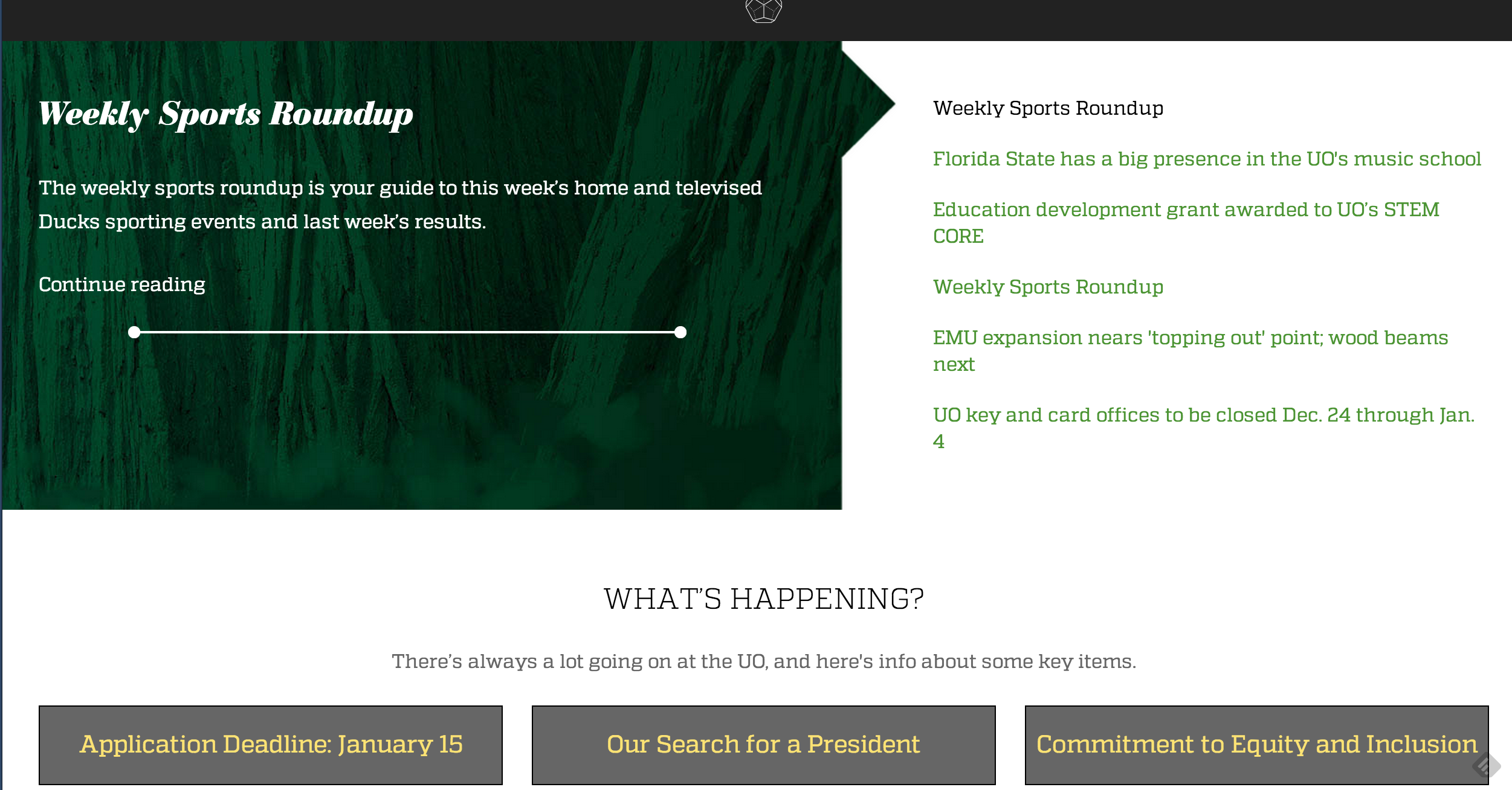
WE SEARCH
AND RE-SEARCH.
WE RESEARCH.
Really? Horrible.
Looks like he’s toasting a marshmallow: http://uoregon.edu/we-search-and-re-search-we-research
Our search,
and re-search
for our President ;)
WE TOAST
AND WE RE-TOAST
AND THEN WE TOAST ‘SMORES!
et qui boivent
et reboivent
et qui reboivent encore
Not to mention “go hard, fast, and finish”. I read it four times and it still makes no sense.
Ugh. I just. I can’t even. The whole project is so incredibly bad. Was there NO user testing? You have to scroll and scroll and scroll to get to where you (might) want to go. And the copy. And the “candid” photos. It’s just awful.
What IF we wanted to be seen as a true R01 University?
What IF we wanted to present ourselves as cutting edge, not cutting corners?
What IF indeed.
Sigh.
This new website is bad. As in painful, sloppy, pointless, embarrassing, hard to use, and – I’ll say it – sophomoric.
Oh, it’s not so bad. I’ve been trying to explain to my UW, OSU and U Cal colleagues whatever the hell has been going on here (“death wish” is the usual guess…), and the new web page does it as well as anything. Replace a few words in the “You Drive Us” crap on the faculty page, and it sounds like dialog from a Harlequin Romance novel. I guess we know what all of the communicators do when they’re not ghost-writing emails or op-eds for the LT’s.
No comment needed.
“NCUR (National Conference on Undergraduate Research) …
Submission Deadline: December 2, 2014”
My condolences.
Good night, and good luck.
Collegial Cabal of Communicators.
Crap.
UO is pissing away money like it has it. Where is Dean Wormer when you need to declare a state of campus emergency?
It would have been a helluva lot cheaper to use a well known mantra with the same level of inspiration (re-worked hope and change?) and intellectual aspiration … like “somewhere over the rainbow…” or “the sun will come out tomorrow”.
……we could get our money back.
……it was April 1.
……it wasn’t so embarrassing.
……
Old Man incorrectly charged the web-designers with a problem that is common hereabouts — a chromic failure of departments and organizations to keep their web pages up-to-date,
this is just juvenile:
“There’s always a lot going on at the UO, and here’s info about some key items.”
Quest.
Question.
Request.
If not “if” what?
U of O
Maybe (shrug)
Perhaps
Could happen
Why not?
Could be worse.
The white streak on the blue shirt (main photo) looks eerily familiar…Is that a blurred swoosh by the pointing finger? Maybe just a smoosh…
Why not, they got the swoosh on top of the library.
http://oregondigital.org/cdm4/item_viewer.php?CISOROOT=/archpnw&CISOPTR=4958&CISOBOX=1&REC=8
[Editor: I made the mistake of following the link below, and feel obligated to give a trigger warning to readers without a well-developed BS tolerance. Anyone who’s ever served on the FAC or a Johnson Hall AAG should be fine though.]
The brand tone is designed to flex for different audiences. For example, when speaking to current and prospective students, turn up “irreverence” and “alive.” However, when creating messaging for a peer or donor audience, turn down those elements and turn up the volume on “progressive” and “extraordinary.” : https://brand.uoregon.edu/brand-positioning
That webpage made me spit out my drink laughing. Love how alums don’t give a crap about “inclusive” or “natural,” while donors aren’t interested in “alive.”
Thanks for the warning. It’s definitely the downtown abbey of the desirable nouveau alum.
seriously, for $5M even I could have made that “tone page” for branding actually play tones, as if it was a sound equalizer. I am quite sure that some combination of sliders would have produced the UO fight song while another combination would have produced appropriate grunting from the curious community.
OMG the brand positioning and tone and voice pages took me back to my TV news broadcasting days when, because ratings were tanking, management commissioned focus groups and hired expensive consultants to come in and tell us what to do or tweak (with similar buzzwords). It almost never worked and became just another way for managers and news directors to extend their tenure until it became obvious they were running a s–t show.
“Simply put, there is nothing that we don’t do well here.”
BWAHH, HA, HA, HA, HA, HA, HA!!!!
I can’t take it anymore.
When I clicked something like meet our scholars it referred to Clark honors and other students. I am puzzled, apparently the faculty are not attractive enough to market to new or prospective students, the new students need to join the already established and exceptional other 19 or 20 year olds. the faculty are irrelevant
Horace (65 BC – 8 BC): Parturient montes, nascetur ridiculus (mus) anas!
Should be “ridicula.” If you poke through the branding style guide, you’ll see that the university seal is no longer to be used on letterhead; the only options are a two-color or monochrome “O” logo. Moles agitata est.
Did you know the O logo is called the “athletic” O? (It supposedly has a more muscular look). You can’t make this shit up.
The athletic/muscular O is supposedly shaped after the Autzen football arena? Somebody told me years ago – I’m trying not to make this shit up. …. Don’t know if it’s actually true though.
I wonder if we academics couldn’t start using the Mens Agit Molem logo again as our letterhead … civil disobedience….? That’s the type of shit we CAN make up….
:-D
The “O” is the shape of the track at Hayward field swallowed up by the outline of Autzen stadium.
ridiculus mus is the original quote; anas was the afterthought. Of course it’s feminine so you are right …
Let’s grade this, shall we?
“We believe in the power of “if”
If we overcome adversity (again). If everything comes up roses. If our Ducks fly higher than they ever have before.
When you ask the big questions, the possibilities are endless. It’s true in classrooms, labs, libraries, or on off-campus study programs around the world. And it’s true on the football field—when we go hard, fast, and finish—in the pursuit of a national championship. At the University of Oregon, we ask “what if,” collaborate, and find a better way.
That’s how we win the day.”
Wow. I’ve seen one of the concept prototypes for the OSU homepage redesign and it’s a very similar layout.
“…our own high expectations to become one of the preeminent AAU research institutions, not just in the United States, but anywhere.”
This should be doable, since no one else is trying to become one of the leading AAU institutions outside the US.
Couldn’t we have an internal website that actually meets the needs of employees? The new site is aimed at prospective students and donors who don’t need access to academic affairs, human resources, duckweb, etc.
That’s crazy talk! But send me your suggestions and I’ll add them to https://uomatters.com/uo_links
Thanks for the links page – you’re my new homepage.
This is important for NTTF:
http://academicaffairs.uoregon.edu/evaluation-promotion-nttf
Of course, it took a while to find the search box on the new site: black on dark green – who would do that?
I love your links page – what a service!
I believe the branders have a subversive subtext with the ‘if’ business. They’re thinking of the classic 1968 movie “If” (starring Malcolm McDowell) in which students revolt against the academy.
Not really. In response to OSU looking the same.
here are some links to other schools heading this way:
http://umich.edu/
http://www.washington.edu/
http://www.arizona.edu/
http://www.asu.edu/
http://www.ucla.edu/
http://www.nd.edu/
http://www.cornell.edu/
I need a shower after looking at all that HTML5. I’m also nostalgic for 1995, the good old days when web designers cared how long something took to load and made it worth your while.
May 1998 site archived on the waybackmachine –
https://web.archive.org/web/19980526174953/http://www.uoregon.edu/
Altavista. This is beautiful, thanks for the memories.
this old wayback page is more interesting than you might think.
Very few people likely remember this “Process for Change” thing that we went through. It is worth reading the summary document (as I recall there were something like 21 working groups) and then trying to discern if there has been “change”.
The Process for Chsnge was staged by Frohnmayer for the legislature’s benefit. I hope you didn’t put much time into it.
Please use a screen name.
The Best Husky Moments of 2014 on the UDub site points the way to the kind of sophistication that is possible in strategic communications.
It reeks serious, proud, academic success. There is nothing corny about it, unlike the UO nonsense.
Seems like our Klingons in Johnson Hall are incapable of such a product for all the money paid them.
What if?
How about WTF?
At the end of the ridiculous “if” ads during Rose Bowl halftime:
” … we if at the University of Oregon.”
Gawd.
Oh joy. I can see colleagues at our national convention eying my name tag and asking, “how’s the iffing going?”
Calvin and Hobbes once said that “verbing wierds nouns.”
What does it do to conjunctions?
At the outset of this project the campus community was supposed to get a new set of design guidelines and templates from this project. NONE of that has come out or looks like it is going to. Unreal. There will continue to be no design leadership and unified brand for the UO gets worse and worse.
There’s some stuff at https://brand.uoregon.edu/brand-positioning
Trigger warning – you’ll need a strong stomach.
The letterhead and print design guidelines are OK, but the web design and stupid slab-serif font is going to scream “2014” in a few short years, and then we’ll get to spend another $5M doing this all over again.
what if?
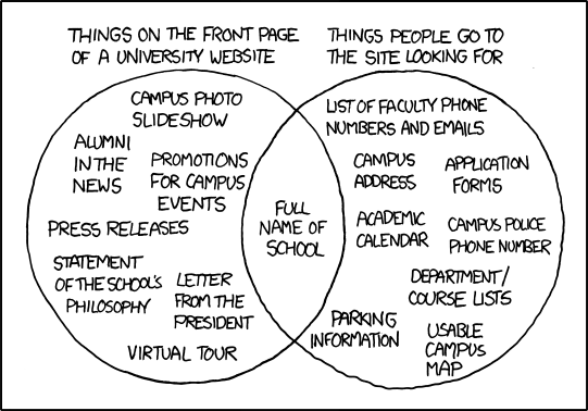
…more relevance points for Randall Munroe.
It’s rubber duckies all the way down.
The fact that faculty don’t like this is proof that it’s on target. You are not the audience. None of us are the audience. Why is that so hard to grasp? I think all the curmudgeons who frequent this site should get together and determine how best to reach millennials. I would love to see what you come up with.
OK, let’s grant that UO is forward-thinking enough to recognize that since millennials have come to expect websites that are non-functional multimedia extravaganzas, the UO website needs an “upgrade” to be taken seriously. Great. But it still sucks sandballs to use it, which by definition makes it bad design. Bad and really overpriced design.
U.S. News & World Report #1 Rated University: Princeton’s website. A university with substance does not need web glitz to “reach millennials.”
Yeah, but they have the whole “Princeton” thing working in their academic mojo column. They’re just coasting on that, you know.