10/11/2014: As part of the UO Matters Sustainability Program I’m recycling last year’s data and comments:
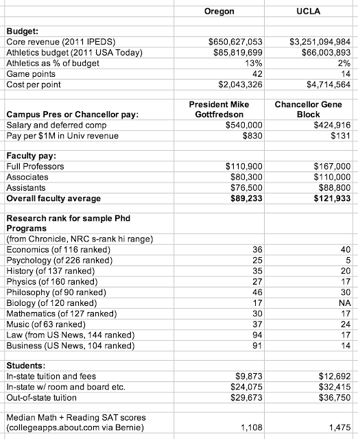
UCLA spends 2% of its budget on sports, while UO spends 13%, for a 650% shellacking. On the other hand, UO’s Econ Phd program beats UCLA’s by 4 points. In general UO’s research ranking looks pretty impressive, relative to the puny inputs we get. But don’t be fooled – the NRC data comes from 2005, and doesn’t yet show the full impact of Frohnmayer’s decision to prioritize big-time sports, by taking money from the academic side.
For a very interesting take on UO’s current world ranking, see UO Foundation board member (and former ASUO President) Iain More, here, tables here. Cocktail party version? The Ducks are the #3 university in football, while the University of Oregon is #551 in the world academic rankings. For a quick and dirty look at the overall NRC data on research, see here.
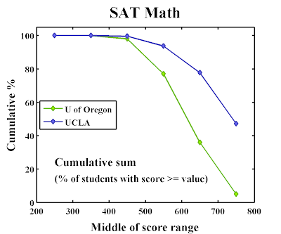
Zillow’s rent index is for LA is $2,389, versus $1,289 for Eugene. On the student SAT metric, UCLA does seem to have a slight advantage. Here are more SAT comparisons, thanks to a helpful reader:


What is that “Middle of score range” doing there on the x-axis?
Curious, where did you get the data?
Sources:
UO: http://ir.uoregon.edu/sites/ir.uoregon.edu/files/CDS_2012-2013_For%20WEB.pdf
UO Historical data: (see links)
CU Boulder: http://www.colorado.edu/pba/cds/cds13/index.htm
Wash. State U: http://ir.wsu.edu/Common%20Data%20Set
UC Berkeley: http://opa.berkeley.edu/statistics/cds/2012-2013.pdf
UCLA: http://www.aim.ucla.edu/profiles/cds.aspx#cdsC
As someone helpfully noted earlier, these can be found by Googling “common data set” for various universities.
The x-axis: The score ranges reported in the datasets are 500-599, 600-699, etc. So the points are plotted at the middle of each of these ranges. For example, 5% of 2012-13 UO students have Math SAT scores in the 700-799 range, and 31% in the 600-699 range, so the value plotted at 650, the middle of the 600-699 range, is 5+31 = 36%, since 36% of students have scores >= this range. Yes, it’s a bit opaque. Just doing the percentages, rather than sums, leads to lots of crossing curves.
The thing I find particularly interesting is how constant the UO scores are over time. People say very emphatically that our students are getting better, or that they are getting worse. At least as SAT scores go, the numbers show that they’re staying about the same. (This is true for the critical reading scores, as well.)
I have a hard time believing the reported data, or at least they’re misleading, if I understand them correctly.
Take the UO curve, it appears to say that half of UO students have math SAT greater than a number which is somewhat above 600. I have a hard time believing that. At the collegeapps website:
http://collegeapps.about.com/od/collegeprofiles/p/U-of-Oregon.htm
it says that 613 math SAT puts you at 75th percentile, not 50th.
Now if the data mean that 36% of UO students have an SAT math above 600, as represented by the point at 650, that I can believe — since the median SAT math at UO is probably a bit above 550 — but as graphed, the data are poorly represented, in my opinion.
But thanks for the clarification, I at least think I understand how the graph is obtained, even though I think it’s misleading.
Ditto with Berkeley, etc.
You’re right. It was a dumb mistake to put the points at the center of each bin, given their meaning. I should have put them at the left edge, to better indicate the cumulative percentage of students with scores >= each value. Next time!
For now, everyone can imagine all the points on each graph shifted to the left by 50.
That should about do it.
I’m sure Uncle Bernie would be proud of you.
Now, if he’d just come clean about Washington State!
There is an upwards trend in scores around 2012 which is about when they stopped increasing enrollment. So if they keep enrollment constant for 5 years, I bet that trend will continue.
[…] * UCLA spends 2% of its budget on sports, while UO spends 13%. 13%! […]