From some nice data visualization tools on Chronicle.com:

and

and spending (note that this is spending by the institution, not cost to the student.)
relative to our OUS defined peers:
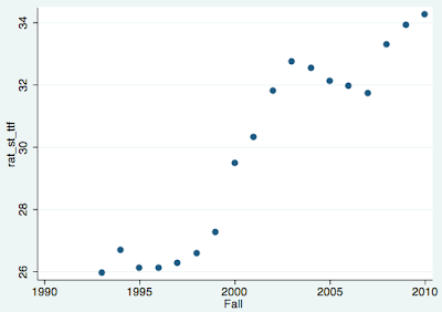
and here’s info on our student faculty ratio:
and just to mix it up a little:
I would say more good than bad, although the financial aid and Pell Grant numbers do not do anything to support the position the administration has taken that we are making UO more accessible. The faculty number is dismal, but again, this is confirmation, not new news. Perhaps the fact that it is visible to all, however, might give our new president more of an impetus to ensure that the upcoming campaign addresses this — and that smaller steps are taken now.
Fantastic! UO’s “similar institutions” peer group for comparison includes Idaho, Louisville, Utah State, Wichita State and North Texas.
Better than the reference to the other ous campuses as peers.
Someone at BMGF has a sense of humor – download the UO data, the file lists our nickname as “Nike”.
Why is the Pell Grant lending so low?
Dog says
Yes these new tools are nice. Keep in mind that the data are complete through 2010 and therefore for faculty ratio, are not accurate for the UO as presently constituted.
The most useful feature of these tools are to get time history. For instance, I used to bitch a lot about our “pathetic” 4 year graduation rate. While still not great, it nonetheless has risen so we are doing
something slightly better than before.
can’t see all the images, dude.